
A Greater Feeling
A brand not just seen, but felt
Svenska Spel brings people and their dreams together. They’ve been doing that for over a century. In a fierce gaming market with ever-growing competition, it’s more important than ever to show who you are, what you stand for, and where you come from.
The new, updated Svenska Spel meets the evolving needs and realities of both the market and its customers. A clear brand that isn’t just seen, but felt. The trust and deep community roots remain – but now with room for even more joy, energy and greater feelings. More dimensions. More senses. Simply more Svenska Spel.

The identity is consistent, but never static – built for a brand always in motion.
An iconic symbol comes to life
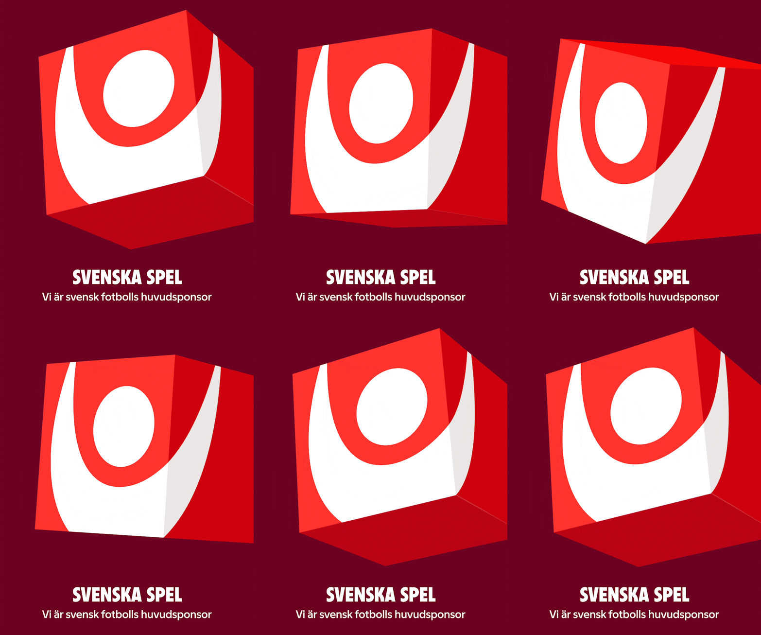
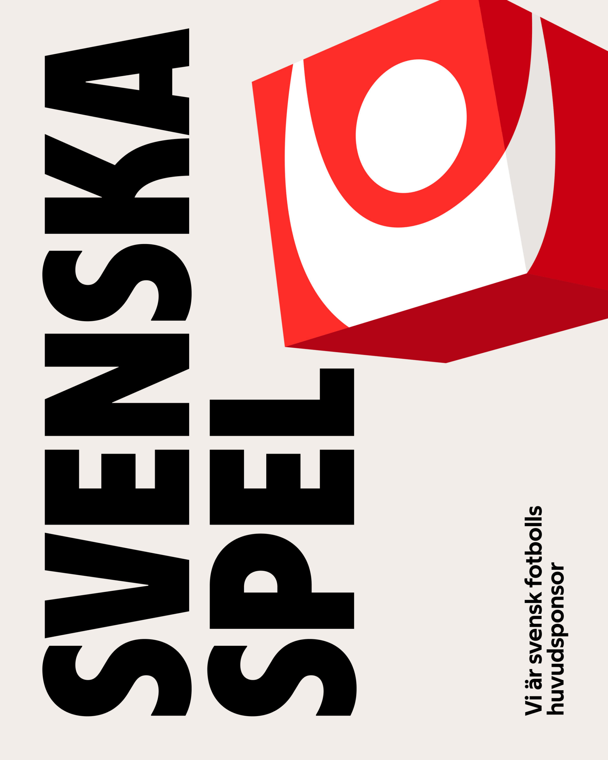
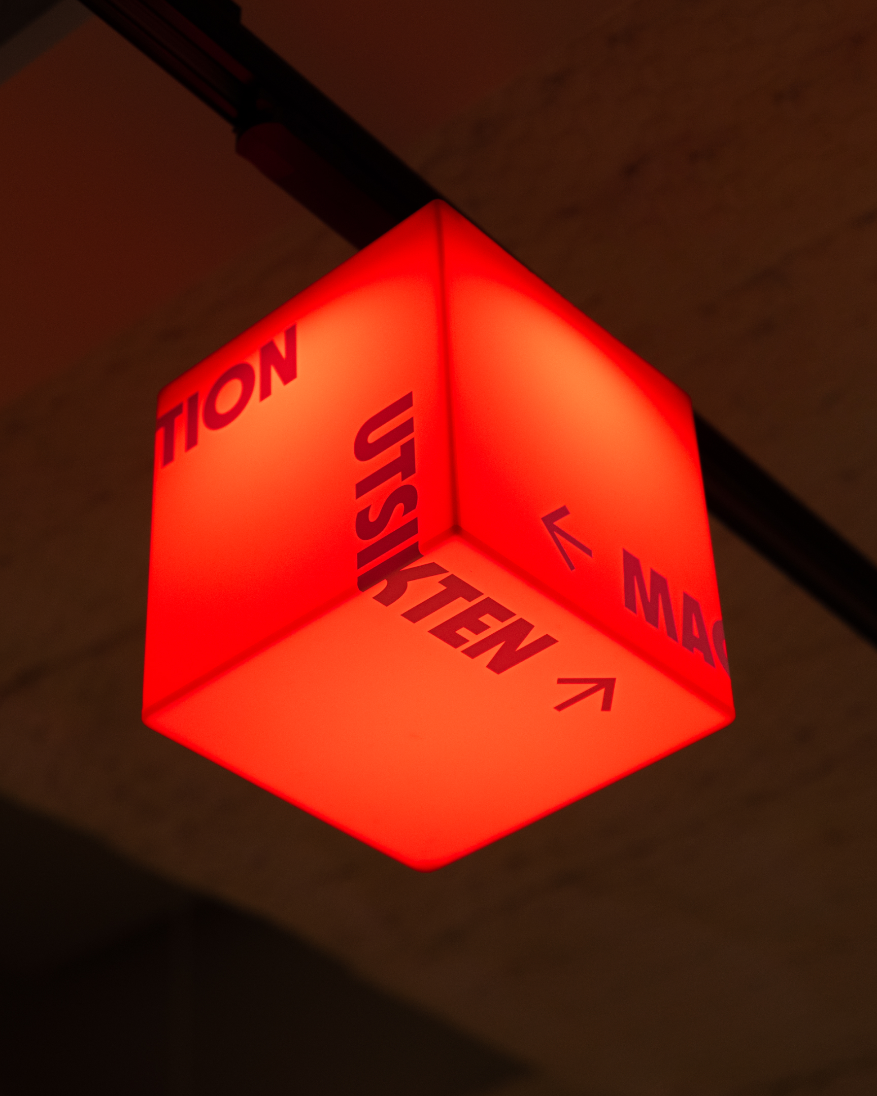
The Winner Cube makes Svenska Spel clearer, stronger and more fun. A cube is the perfect symbol for a multi-dimensional offering – always in the game, always in motion.
A confident voice for a market leader
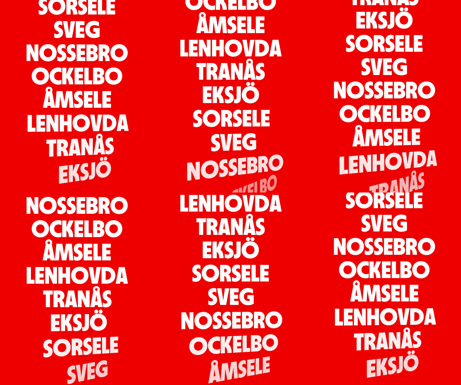
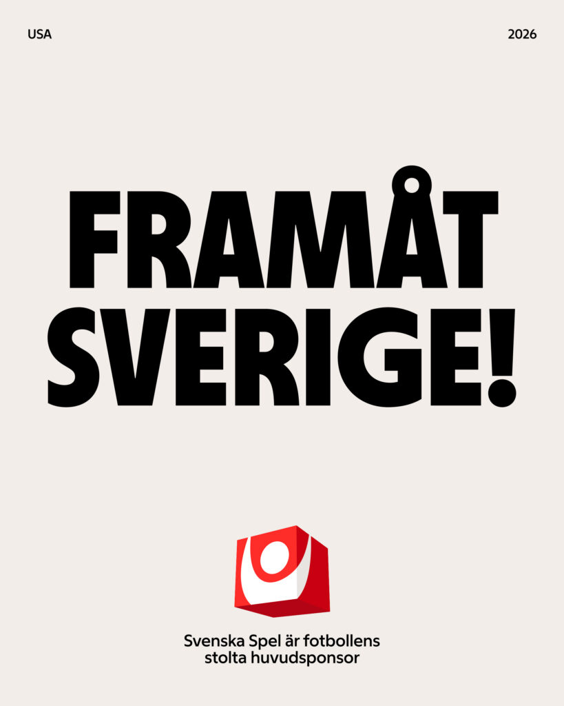
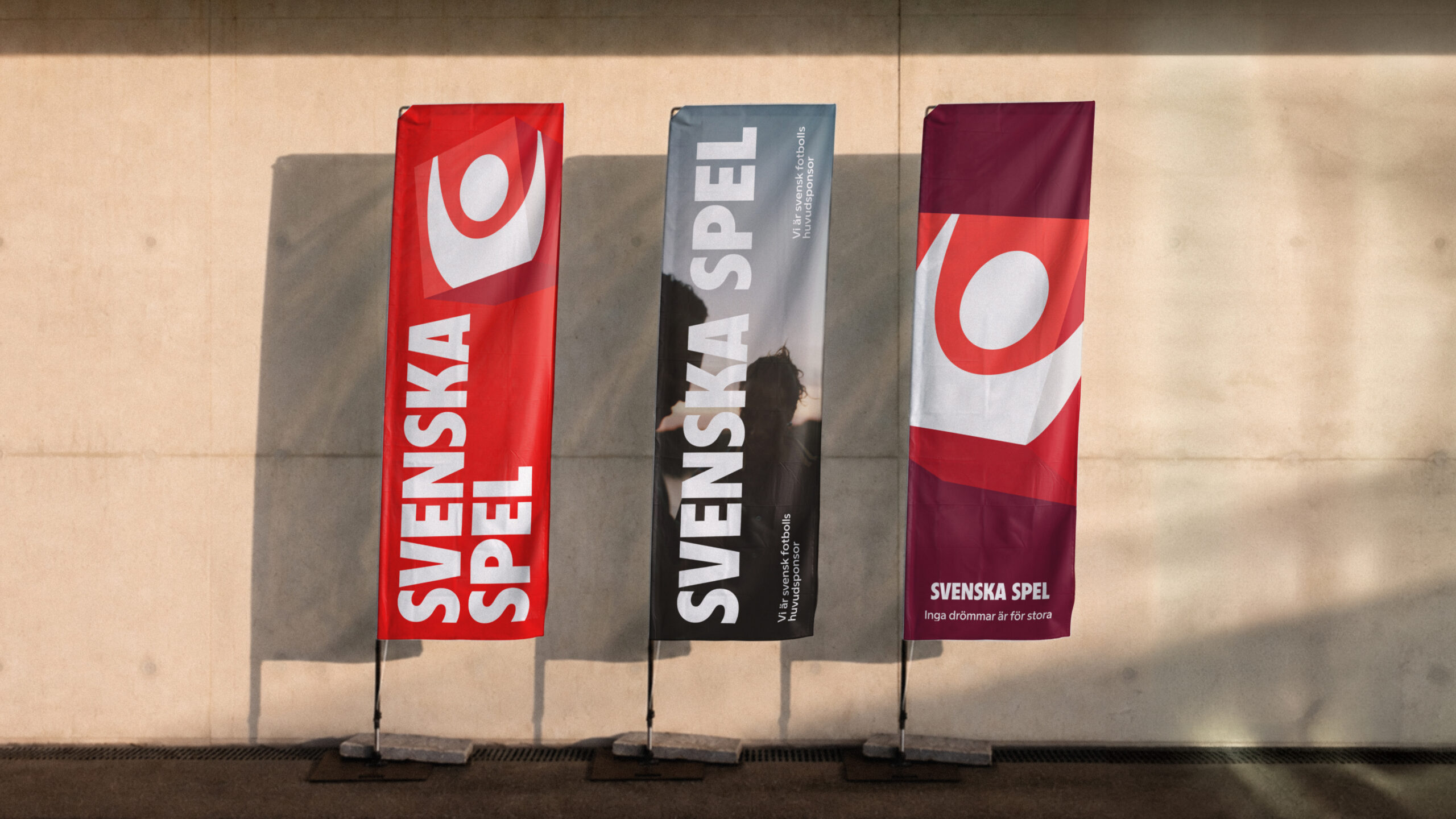
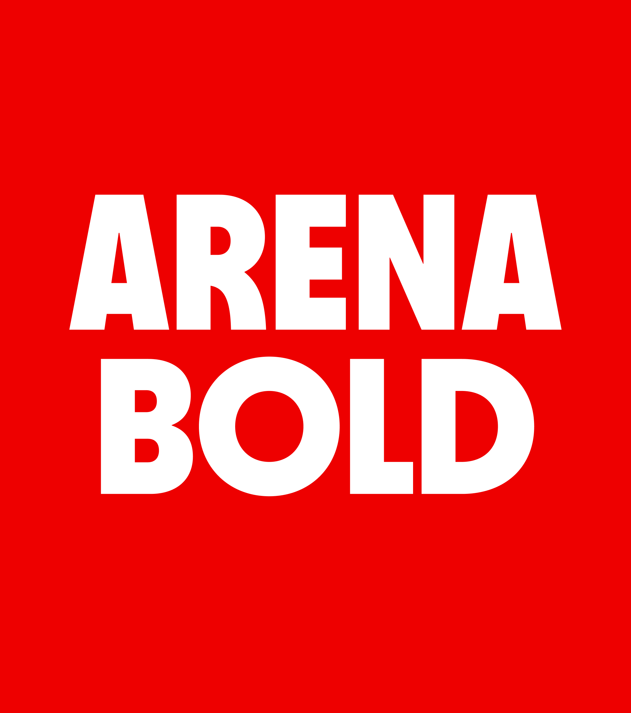
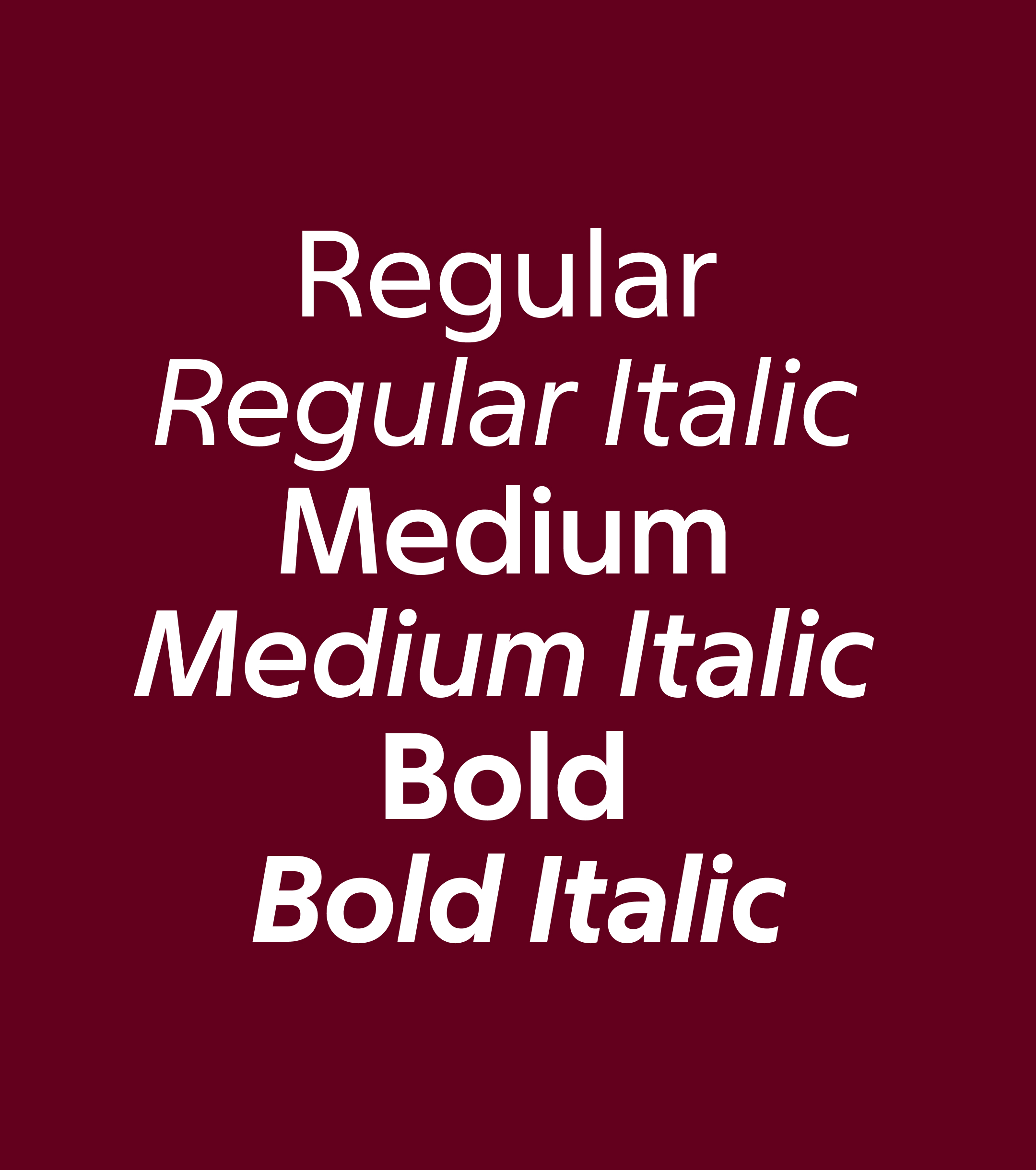
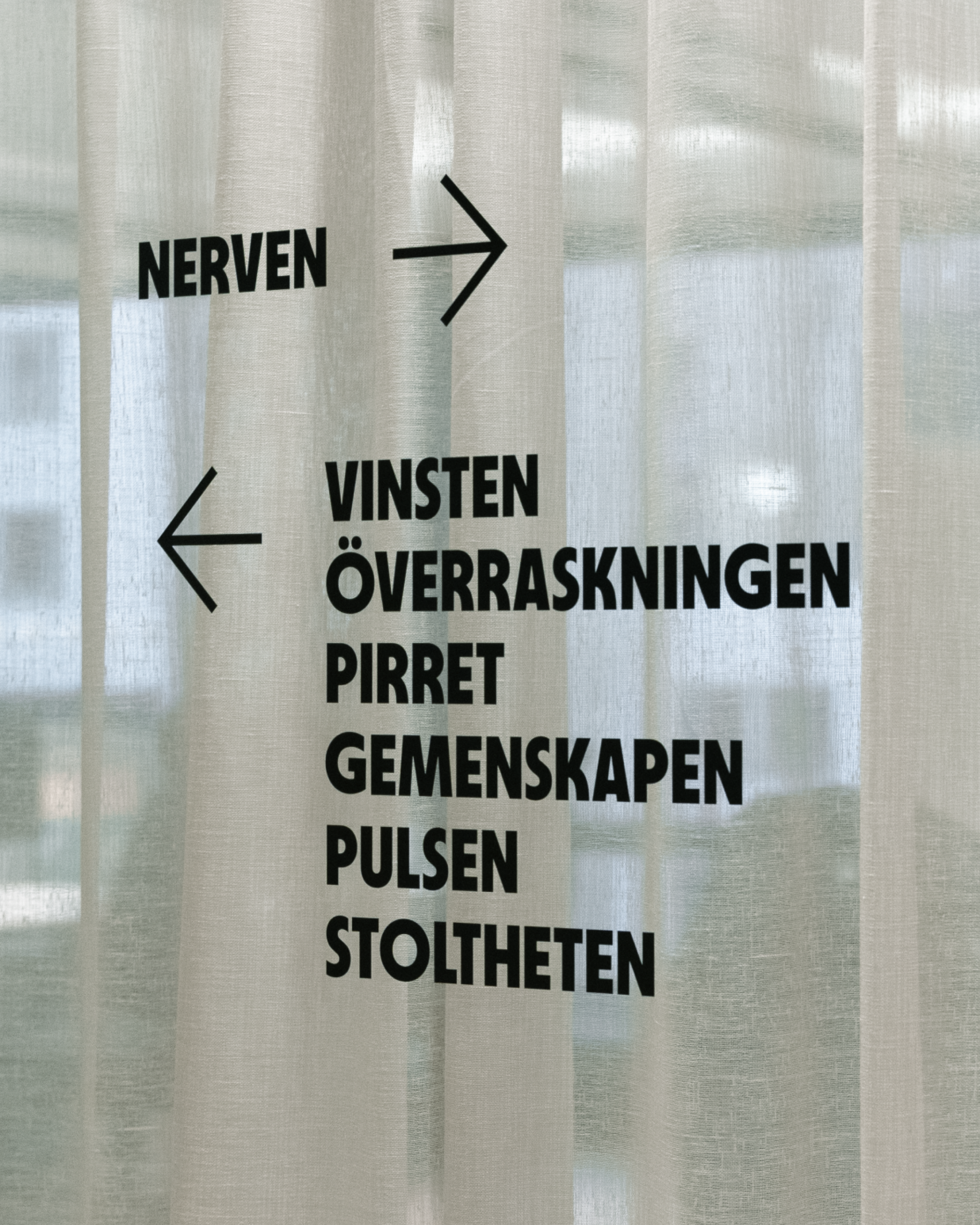
The bespoke typefaces give Svenska Spel its own voice. One that is proud, approachable and full of energy. With a distinct feel and a strong presence. Confident enough to lead.

Feelings are best expressed through imagery
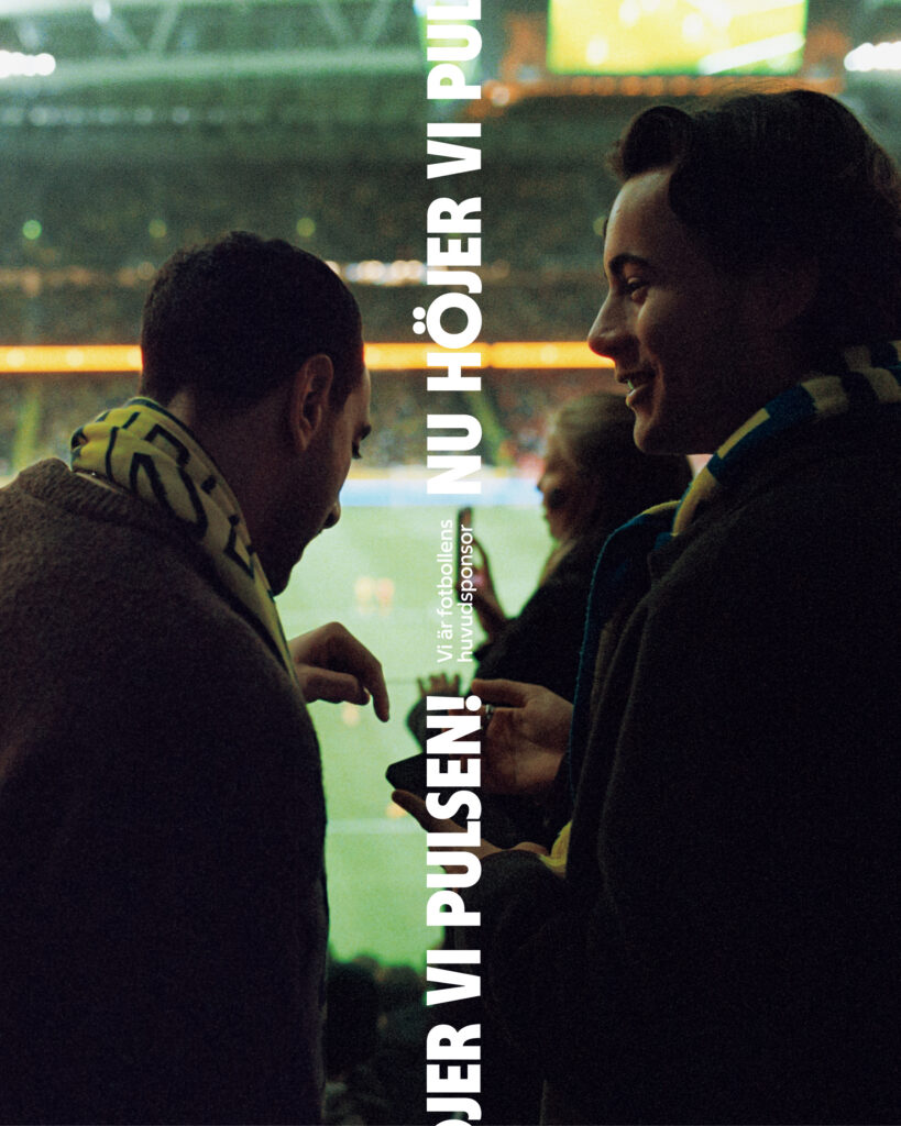
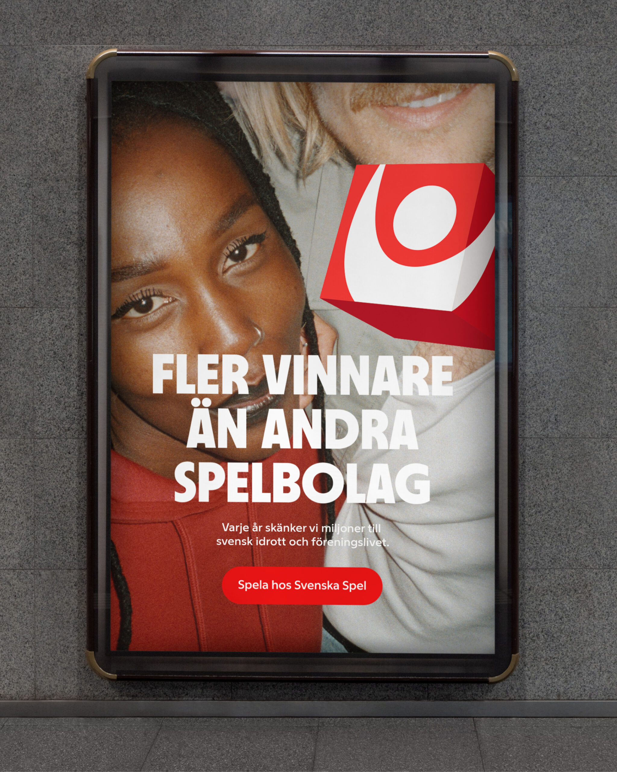
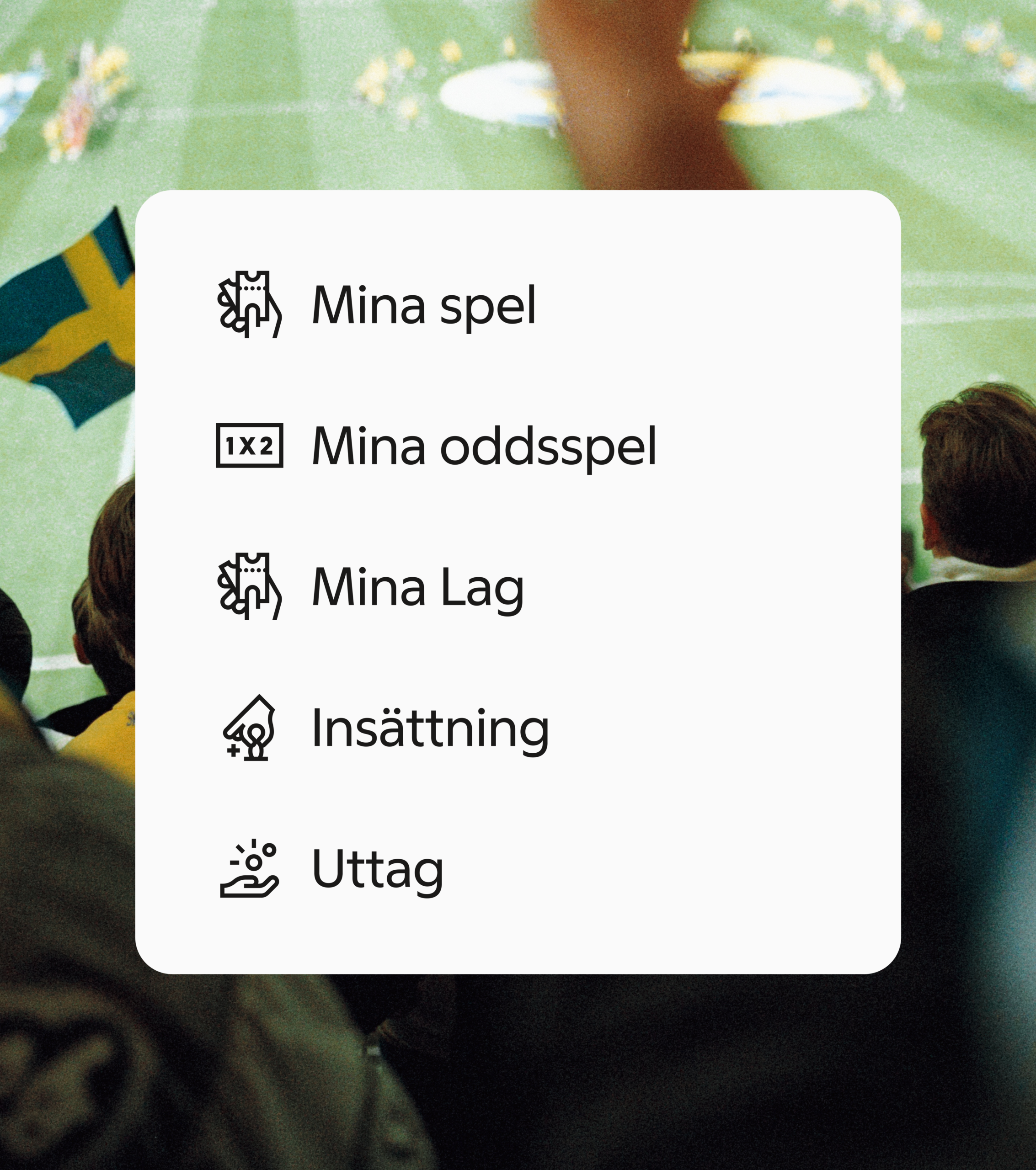
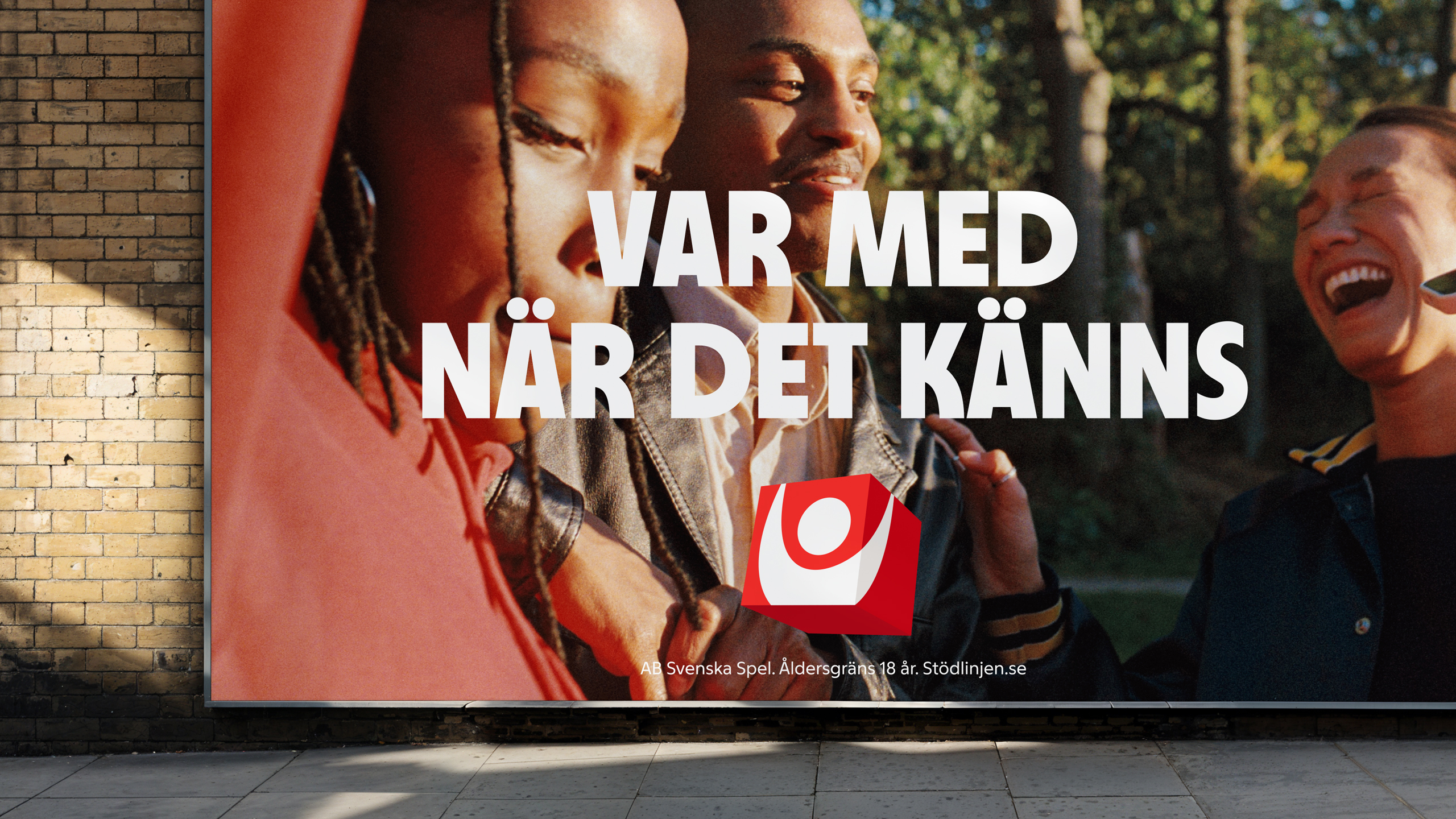
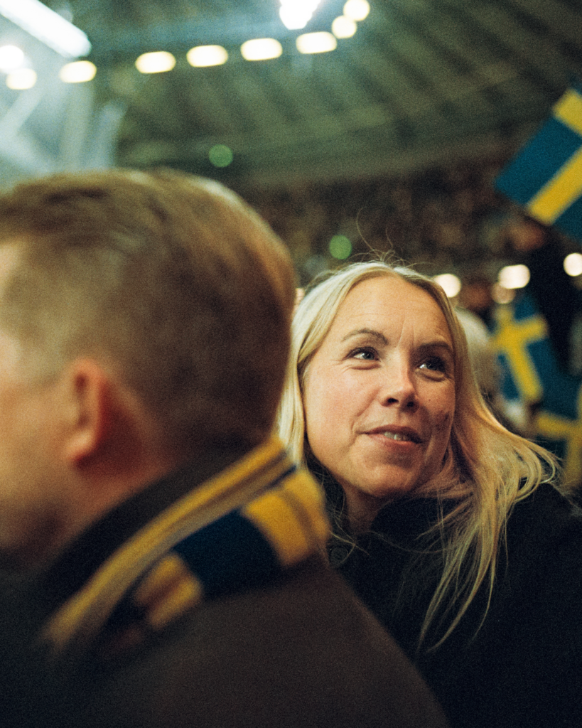
"Together for a greater feeling" is the overarching concept for the visual language. Through a wide emotional range, the visuals capture what it feels like to be a part of Svenska Spel. The style is authentic, positive and personal. Shot entirely on analog film.
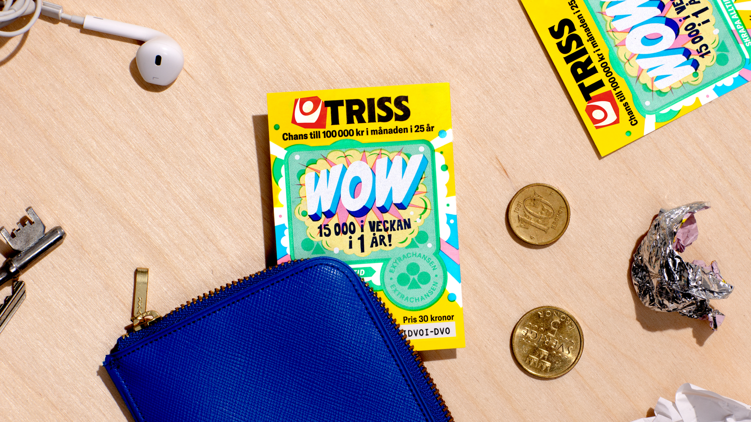
Injecting new energy into all sub-brands
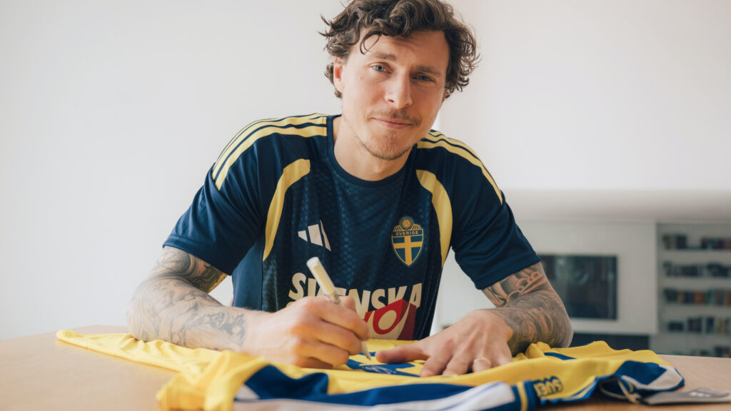
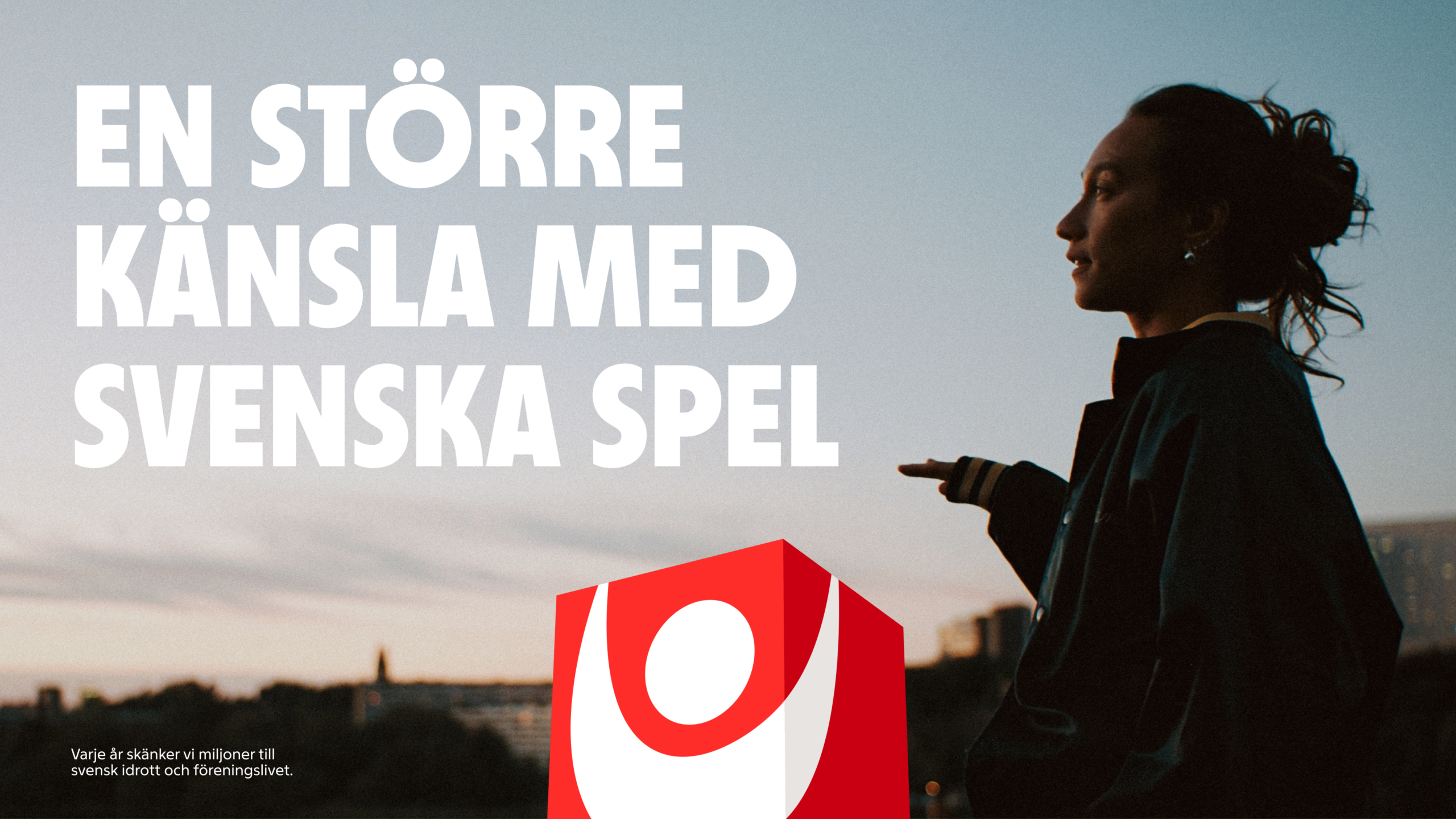
A modern and appealing Svenska Spel injects new energy into all of its sub-brands. A stronger presence that also feeds more gaming joy back into the master brand.
Attribution
Locations
Capabilities